
BRYAN MURRAY
DESIGNER | PHOTGRAPHER | VIDEOGRAPHER


LOGO DESIGN
Hoist Liftruck MFG.
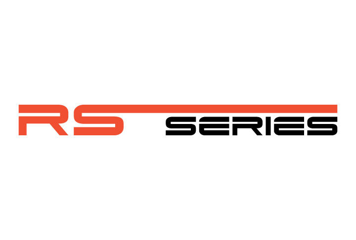
Hoist is a forklift manufacturer that contacted me to help them design logos for two different forklift truck lines. One project was a logo redesign for the Neptune trucks, which is primarily used in marinas. The other project consisted of creating an entirely new logo for their Reach Stacker Series or RS Series truck, which specializes in stacking shipping containers. Each logo needed to exemplify the forklift’s specialties, strengths, as well as fit within the brand standard. For the Neptune logo redesign, I wanted to focus on a bold typeface with a wave-like shape to connect the fact that the truck’s main usage is in marinas. I also included the Trident, the symbol of Neptune, the Roman god of the sea. For the RS Series logo, I wanted to create an industrial-looking logo which showed the truck’s versatility. In order to do this, I extended the arm of the “S” over the word “Series” in the logo to symbolize the ability of the truck’s arm to reach great lengths to stack or lift any number of loads. Each logo brought a clean, modern look to the trucks. Adobe Illustrator was used to create the logos.